5 Web Design Elements That Convert San Diego Businesses
Before Daily Grind Media, I ran a small training studio in North Park for six years. Twenty-two members at the peak, a leaky roof, and a website I built myself on a Saturday because I didn't want to pay anyone for it. That site brought in exactly four leads in its first year. Not four sales — four leads. I know exactly why now: the homepage led with a stock photo of a stranger doing a lunge and a paragraph about our "passion for fitness." It told visitors nothing about where we were, what a session cost, or what to do next. That's the same mistake I now see on maybe half the San Diego small business sites we audit — dentists in Clairemont, HVAC companies in El Cajon, boutiques in Encinitas. The traffic shows up. The site just doesn't ask for the sale.
By Loren Anderson · September 21, 2026 · 38 min read
Why Most San Diego Websites Aren't Built to Convert
Most local business websites here get built backwards. Someone hires a designer, the designer asks what pages they want, and three weeks later there's a Home, About, Services, and Contact page that looks fine and converts nothing. Nobody asked what the visitor is trying to decide in the first ten seconds, so the site never answers it.
We see this constantly with service businesses along the coast — a Pacific Beach surf shop, a Carlsbad contractor, a La Jolla med spa. The traffic is often decent. Google Business Profile sends people over, a Yelp listing sends people over, an Instagram bio link sends people over. But the site itself acts like a brochure instead of a salesperson, and the bounce rate on mobile sits north of 70%.
Some of this ties directly into search rankings too — a site built without conversion structure usually skips the technical basics search engines reward, which is a big reason we see so many SoCal brand websites overdue for a refresh. Design and SEO aren't separate problems on a small business site. A page that loads slow and confuses visitors loses rankings and loses the sale on the same visit.
The fix isn't a redesign for the sake of a redesign. It's rebuilding around five specific elements, each one solving a real point where visitors currently drop off.
Element One: A Homepage That Passes the Five-Second Test
Give a stranger five seconds on your homepage. If they can't answer what you do, where you do it, and why they should pick you over the next search result, the homepage has already failed — no matter how good the photography is.
The fix is structural, not creative. The first screen a visitor sees, before any scrolling, needs three things: a headline naming the service and the service area ("Residential Roofing in San Diego County," not "Quality You Can Trust"), a single clear next step (call, book, or quote), and one piece of visual proof — a real photo of real work, not a stock image of a stranger in a hard hat.
When we rebuilt the site for a Point Loma electrician, the old homepage opened with a slideshow of generic tool close-ups and a headline reading "Powering Your World." We replaced it with "Licensed Electrician Serving Point Loma to Poway" over a photo of the actual crew, with a click-to-call button above the fold. Quote requests from the homepage went from about 3 a week to 11 within the first month, with no change in traffic volume — same visitors, clearer ask.
If your homepage currently opens with an About-Us style mission statement, that's the first thing to cut. Visitors decide whether to stay before they care why you started the company.
Element Two: Proof That Names the Neighborhood
Generic testimonials don't do much work anymore. "Great service, highly recommend!" could belong to any business in any city. What converts is specificity — a name, a neighborhood, and a real outcome someone can picture themselves getting.
Compare "Amazing experience!" to "Booked a same-day inspection for our Carlsbad rental and had the report back before 5pm — saved us from a bad tenant." The second one reads as true because it names a place and a result. It also does double duty for local search, since neighborhood names in testimonial copy reinforce the geographic relevance search engines and readers are both looking for.
For our own client work, we push for three to five detailed testimonials over a wall of twenty short ones. Each should answer: what was the problem, what did we do, what changed. A Solana Beach dentist we worked with replaced a generic reviews widget with four testimonials structured that way, each naming a specific procedure and a specific outcome. Time on page for that section tripled based on scroll-depth tracking, and the contact form conversion rate on that page rose noticeably within six weeks.
Case studies work even better than testimonials when you can build them. A single paragraph plus a before/after photo — a redone kitchen in Rancho Bernardo, a rebuilt storefront in the Gaslamp — does more convincing than a star rating ever will, because it shows the actual work instead of asserting quality.
Location specificity also matters for a site's broader search visibility, which is worth pairing with the fundamentals covered in our piece on common SEO mistakes SoCal brands make — vague proof and vague location signals tend to travel together.
Element Three: Mobile-First Structure, Not a Mobile-Friendly Patch
There's a difference between a site that's mobile-friendly and one that's mobile-first, and most small business sites in San Diego are only the former. Mobile-friendly means the desktop layout shrinks down without breaking. Mobile-first means someone actually designed the phone version first — content order, tap targets, form length — and scaled it up to desktop after.
The difference shows up in specific failures we find during audits: a click-to-call button that's technically present but buried under three scrolls, a contact form with eleven fields that's painful to fill out with a thumb, or a navigation menu that requires three taps to reach the page someone actually wants.
For a Chula Vista landscaping company, we rebuilt the mobile experience around a single rule: anything a visitor might want to do (call, request a quote, see the service area map) had to be reachable within one tap from any page. We also cut the quote form from eleven fields to four — name, phone, service, ZIP code. Mobile form completions increased by roughly 60% after the change, and that's before accounting for the traffic mix, which already skews heavily mobile for a business searched from a truck or a front porch.
We go deeper on this exact rebuild process, including a practical checklist, in our guide to mobile-first UX for small SoCal businesses. If your analytics show more than half your traffic on mobile and your conversion rate on mobile is meaningfully lower than desktop, that gap is usually structural, not aesthetic.
Element Four: Page Speed You Can Measure in Seconds
Speed isn't a nice-to-have. It's a conversion element with a number attached. Google's Core Web Vitals set a Largest Contentful Paint (LCP) threshold of 2.5 seconds as the line between "good" and "needs improvement," and most of the local business sites we test land at 4 to 6 seconds on mobile — largely from unoptimized hero images and bloated page-builder scripts.
Every additional second of load time is a real, measurable leak. A visitor searching "emergency plumber Mission Valley" from a parking lot isn't going to wait through a slow-loading hero video. They'll tap back and call the next result.
The fixes are usually unglamorous and cheap relative to the payoff:
For an Oceanside auto shop client, cutting LCP from 5.8 seconds to 1.9 seconds correlated with a 22% increase in form submissions over the following two months, with traffic holding roughly flat. We break down the full technical checklist in our page speed optimization guide for SoCal sites, and you can check your own numbers for free using Google's Core Web Vitals reporting.
Element Five: Conversion Paths Built Around How People Actually Buy
Not every visitor wants to do the same thing, and treating every page like it needs the same "Contact Us" button ignores that. Someone searching for an emergency locksmith wants to call right now. Someone comparing wedding photographers wants to browse a gallery and fill out a form once they've decided. Someone booking a fitness class wants a calendar, not an email exchange.
Match the ask to the intent. Urgent local services (plumbers, locksmiths, towing) should lead with a phone number, not a form — every extra step between intent and action loses someone. Considered purchases (photography packages, web design projects, remodels) do better with a short qualifying form that sets expectations on price range and timeline. Anything schedulable (classes, consultations, appointments) converts best with an embedded booking widget that removes the back-and-forth entirely.
One tactic we lean on heavily for SoCal clients running paid traffic or seasonal promotions is the micro landing page — a stripped-down page built for one offer, one audience, and one action, separate from the main site navigation. A Encinitas surf school used this for a summer camp promotion: one page, one form, one price, no menu to distract from it. It outconverted their standard "Programs" page by more than 3x for that specific campaign. We cover how to build these properly in our guide to micro landing pages for SoCal businesses.
The underlying rule: count the steps between a visitor landing on the page and completing the action. Every step you remove is a percentage point or more back in your conversion rate.
Navigation That Doesn't Make People Hunt
Menus are where a lot of well-designed sites quietly lose people. A visitor arrives ready to book, can't find the booking page within two clicks, and leaves. This happens most on multi-service or multi-location businesses — think a med spa group with locations in Del Mar and Carlsbad, or a contractor offering five different service lines.
The rule we use: any page a visitor is likely to want should be reachable in two clicks or fewer from anywhere on the site, and the navigation labels should use words customers actually search, not internal company jargon. "Kitchen Remodels" beats "Interior Solutions." "Emergency Service" beats "24/7 Support Division."
For a multi-location medical practice with offices from Solana Beach to Poway, we restructured the nav from a flat list of eight generic links into a dropdown organized by location and service, with the phone number pinned in the header on every single page regardless of scroll position. Calls attributed to the website, tracked through a dedicated tracking number, increased by about 30% over the following quarter — not from more traffic, but from fewer people getting lost before they could call.
A sticky header with click-to-call, a breadcrumb trail on service pages, and a footer that repeats the core navigation for anyone who scrolled all the way down without acting — these are small, unglamorous fixes, but they compound. We go into more detail, including common mistakes on service-area sites, in our piece on navigation UX for Southern California sites.
Accessibility as a Conversion Lever, Not a Compliance Checkbox
Accessibility usually gets framed as a legal risk to manage — and it is one, with ADA-related web lawsuits filed against California businesses regularly. But treating it only as risk mitigation misses that accessible design converts better for everyone, not just visitors using assistive technology.
Sufficient color contrast helps a visitor reading a phone screen in direct Pacific Beach sunlight, not just a visitor with low vision. Properly labeled form fields reduce abandoned forms across the board, not just for screen reader users. Larger tap targets help anyone with a smaller phone or a hurried thumb, not just visitors with motor impairments. The overlap between "accessible" and "easy to use" is much larger than most business owners assume.
The baseline reference here is the Web Content Accessibility Guidelines (WCAG), and hitting WCAG 2.1 AA is a realistic target for most small business sites without a major budget. Practical starting points: check color contrast ratios on your CTAs, make sure every form field has a visible label (not just placeholder text that disappears when you click in), and confirm your site is fully navigable by keyboard alone.
A La Mesa nonprofit client came to us after an accessibility complaint. Beyond the fix, restructuring their donation form with clear labels and better contrast correlated with a jump in completed donations the following quarter — the same changes that resolved the complaint also removed friction for every donor. We walk through the specific checklist in our accessibility guide for SoCal businesses.
What This Looked Like for a Solana Beach Fitness Studio
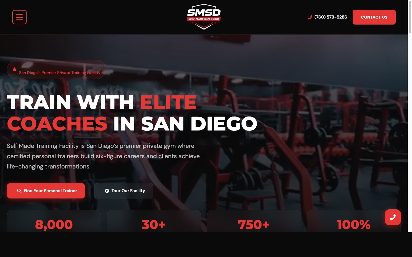
Here's where the fitness background comes back in. Last year we rebuilt the site for a 30-member strength and conditioning studio in Solana Beach. Their old site had exactly the problems I made in my own gym years earlier: a homepage with a mission statement above the fold, a class schedule buried three clicks deep in a PDF, and a booking process that required emailing the owner directly.
We applied all five elements. New homepage led with "Small Group Strength Training in Solana Beach" and a photo of an actual class mid-session, with a "Book a Free Trial Class" button above the fold. Testimonials named specific members and specific results — a 52-year-old client's return to running after a knee injury, not a generic "love this gym!" quote. The booking flow moved to an embedded calendar widget, cutting the sign-up process from an email exchange to a 90-second form. Mobile load time dropped from 5.1 seconds to 2.1 seconds after image compression and cutting three unused plugins.
Results over the following 90 days: trial class bookings went from roughly 4 per month to 19 per month, and the studio converted about 40% of those trials into paying memberships — bringing membership from 30 to just over 40 without any increase in ad spend. The owner didn't change the product. The website just stopped losing people who had already decided to show up.
Your 30-Day Website Conversion Audit
You don't need a full redesign to find out where your site is leaking leads. Run this over the next 30 days:
Pick one thing from this audit and fix it before you touch anything else. If your mobile LCP is over 4 seconds, start there — it's usually the cheapest fix with the fastest payoff. If your homepage still opens with a mission statement instead of a service and a location, rewrite that headline this week. The studio in Solana Beach didn't fix everything at once either. They fixed the booking flow first because it was bleeding the most obvious leads, and the rest followed once they could see it working.
Questions
What makes a website actually convert visitors into customers?
Conversion comes from clarity and friction removal, not decoration. A converting site tells visitors what you do and where you serve within five seconds, loads fast on mobile, shows proof specific to their situation, and puts the next step (call, form, booking) somewhere they don't have to hunt for it.
How fast should a San Diego business website load?
Aim for a Largest Contentful Paint under 2.5 seconds on mobile, per Google's Core Web Vitals thresholds. Most local business sites we audit load in 4-6 seconds because of unoptimized images and bloated page builders, which is enough delay to lose a meaningful share of mobile visitors before the page even renders.
Does mobile-first design really matter for local businesses?
Yes. Most local search traffic in San Diego — someone searching 'plumber near me' or 'yoga studio Carlsbad' from their phone — happens on mobile. If the mobile layout is a squeezed-down version of the desktop site, the tap targets, forms, and click-to-call buttons usually don't work the way they need to.
How many testimonials should a website have to build trust?
Three to five detailed testimonials tied to specific results and neighborhoods outperform a wall of twenty generic five-star quotes. Specificity does the convincing — a name, a location, and a real outcome reads as credible; a string of 'great experience!' quotes reads as filler.
What's the difference between mobile-friendly and mobile-first design?
Mobile-friendly means a desktop site that resizes without breaking. Mobile-first means the layout, content order, and calls to action are designed for the phone screen first, then scaled up. The difference shows up in things like button placement, form length, and whether click-to-call actually sits in a thumb-reachable spot.
Should every local business website have a booking or contact form on every page?
Not identical forms, but every page should have a clear, low-friction next step. A homepage might carry a phone number and a short form; a service page might carry a booking widget; a blog post might carry a single relevant internal link. Matching the ask to the page's intent converts better than repeating one generic CTA everywhere.
More from the studio