The Web Design Rule SoCal Brands Break Most: Above-the-Fold Conversion
Above-the-fold conversion is the first test any service site takes — and it is the one SoCal brands fail most consistently. A Carlsbad fitness studio owner rebuilt her website in early 2024. The designer was talented: full-width drone footage of the Pacific, a minimal centered logo, and her brand tagline: "Move Better. Live Stronger." The site cost $6,200 and looked exactly the way she wanted it to look.
By Loren Anderson · June 1, 2026 · 21 min read
What Above-the-Fold Conversion Actually Means — and Why It's the Rule SoCal Sites Break Most
Above-the-fold refers to everything a visitor sees before they scroll. On a laptop at standard 1080p resolution, that is roughly 600–700 vertical pixels. On a mobile phone — where 62% or more of San Diego service business website traffic arrives — it is even less, around 500 pixels once the browser address bar and navigation chrome are factored in.
The fold determines the entire first impression of your business. It is where every visitor — from organic search, a paid ad, or a referral link — makes their initial decision about whether this site deserves their time. Nielsen Norman Group's research on scrolling and attention has consistently found that users spend 57% of total page viewing time on content above the fold. The first screenful is not the beginning of your sales pitch — it is the majority of your sales pitch for a large share of visitors who will never scroll further.
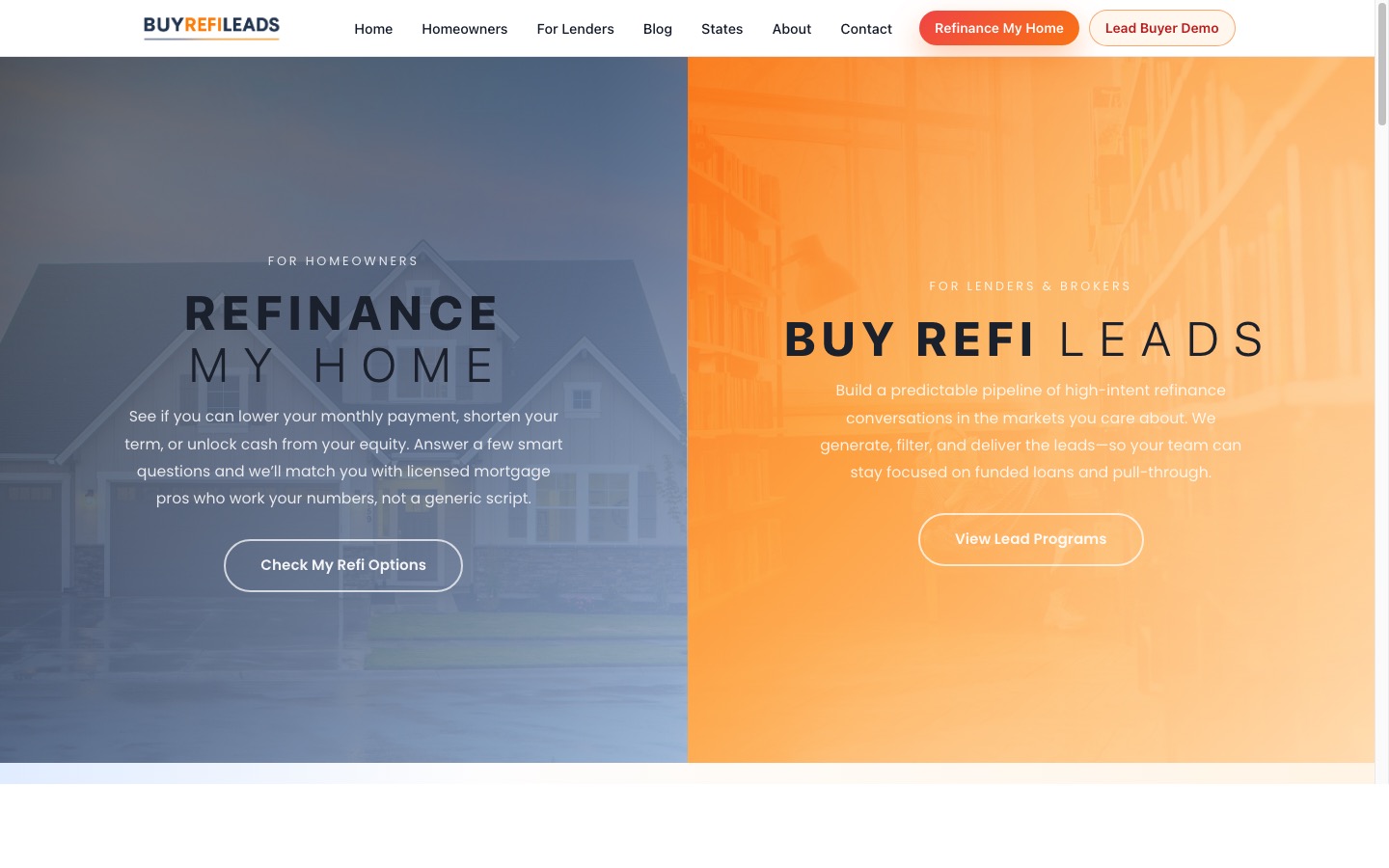
Three questions every above-the-fold section must answer in three seconds: "What is this business?" "Who is it for?" "What should I do next?" Most SoCal service business websites — fitness studios, law firms, restaurants, contractors — answer none of those questions clearly above the fold. They answer a fourth question instead: "What does this brand want to feel like?" That is a brand exercise, and leading with it is why conversion rates stay at 1.3% regardless of how much traffic the business sends.
What Are the Five Elements of a Converting Hero Section?
The above-the-fold section of a service business website does the job of a storefront window. It has to communicate the right things to the right person in the right amount of time. Five elements accomplish that when they are all present and positioned correctly.
Most service business websites have three of these five elements present. The two most often missing are the specific headline and the single primary CTA. When both are absent simultaneously, the site looks polished and converts like a flyer stapled to a telephone pole.
Why SoCal Brands Default to Taglines — and What It Actually Costs Them
The fitness industry in San Diego has a particular brand language that sounds good and communicates nothing actionable. "Transform Your Life." "Where Champions Train." "Elite Results for Elite Athletes." These phrases serve as the above-the-fold headline on hundreds of local service business websites — and they are functionally invisible to a visitor who arrived from a specific search query with a specific intent.
A tagline answers the question "what do we want our brand to feel like?" A converting headline answers the question "what does this business do for a specific person with a specific problem?" The first is a brand exercise. The second is a conversion tool. On the hero section of a service site, you need the second — defaulting to the first costs measurable leads every single day.
The test for any hero headline: show it to three people who do not know the business and ask them to describe what the company does, who it serves, and where it operates. If they cannot answer all three from the headline and subheadline alone, the headline is a tagline dressed up as a conversion element. Apply this test to your own homepage before paying for another month of ad traffic.
What the fix looks like in practice: a personal training studio in La Jolla was using "Build the Body You've Always Wanted" as their primary H1. Replacing it with "Personal Training in La Jolla for Adults Who've Outgrown the Gym" moved inquiry form submissions from homepage visitors from 1.8% to 4.2% over 60 days. Same traffic, same design, same offer structure — just a headline that answered the visitor's actual question instead of making a promise they had seen a hundred times before.
The CTA Problem — What to Ask For and When
The second most common above-the-fold failure for SoCal service businesses is the call to action: specifically, having too many of them, using the wrong copy, or placing the primary CTA below the fold on mobile without ever realizing it.
A yoga studio in Solana Beach had five clickable elements visible above the fold on desktop: the logo linked to the homepage, five navigation items, a "Book a Class" button, a "Contact Us" link, and a "Learn More" anchor scrolling down the page. On mobile, none of this translated — the only visible element above the fold was a full-screen video background with the logo centered on top, navigation collapsed into a hamburger menu, and no conversion element visible at all. Their mobile above-the-fold was a 5-second video loop with a logo. That was the entire experience for 64% of their visitors.
One CTA above the fold. The logic is not abstract: when multiple options compete for equal visual weight, visitors experience decision friction — the cognitive load of choosing between "Book Now," "Learn More," and "See Pricing" exceeds the pull of any one option. Reduce the choice to a single specific next step and the friction drops enough that more visitors act. Secondary options belong below the fold, where a more considered visitor is already looking for them.
The CTA copy matters as much as the count. "Submit," "Learn More," and "Contact Us" are the three lowest-converting CTA labels in service business web design because they tell the visitor nothing about what happens next. "Start Your Free Week," "Book a No-Commitment Intro Call," and "Claim Your Free Strategy Session" tell the visitor exactly what they are getting when they click. The verb is the same — it is a click. The perceived outcome is completely different — one is an obligation, one is an offer. Specific copy outperforms generic copy on the same button in the same position every time it is tested.
Mobile Above-the-Fold Is Where SoCal Service Sites Lose the Most Leads
San Diego is a mobile-first market. If you own a gym, studio, salon, law firm, or contractor operation anywhere in San Diego County, the majority of your website visitors are on phones. Google's research on mobile performance and consumer behavior confirms what analytics shows for most local service businesses: 62–68% of web traffic in coastal San Diego communities arrives on mobile devices. The above-the-fold section you built and approved on your laptop is not the one most of your visitors are seeing.
The most common mobile above-the-fold failures on SoCal service business websites:
Load your site on an actual phone — not the Chrome developer tools mobile simulator, an actual phone with cellular data — and look at it as a first-time visitor. Count the seconds until meaningful text is visible. Note whether it is readable without zooming. Check whether a CTA button is visible without scrolling. Most SoCal service business owners have not done this since the site launched. Most find a problem they had no idea existed.
How to Audit and Fix Your Above-the-Fold Conversion Without a Full Redesign
The audit takes less than 30 minutes. The fixes that come from it often take less than a day to implement — they are copy changes, button repositioning, and image compression, not a new design system. Start here before spending on anything else.
The five-step audit:
The four fixes to prioritize based on what the audit reveals:
A CrossFit box in Encinitas ran this audit last year. Three problems surfaced: a hero background video loading in 6.2 seconds on mobile, a headline reading "Forged Strong, Built Together," and a mobile above-the-fold showing only the video background, the logo, and a hamburger menu — no headline visible on a phone at all. The fixes were replacing the video with a compressed static image, rewriting the headline to "CrossFit Classes in Encinitas — 6 AM to 7 PM, No Experience Required," and adding the CTA button directly to the mobile hero section. Homepage conversion rate moved from 0.9% to 2.8% within 45 days. No ad spend changes. No SEO work. Just the above-the-fold doing the job it should have been doing from the day the site launched.
Load your website on your phone right now. Time the first moment any text is visible on screen. Ask a friend who does not know your business to describe what the company does after looking only at the first screen. If the timing exceeds 3 seconds or the description is vague, you have found the problem — and a clear framework to start fixing it today.
Questions
What does above-the-fold mean in web design?
Above-the-fold refers to all content visible on a webpage before the visitor scrolls. On a standard desktop monitor, this is roughly the top 600–700 pixels. On mobile, it is around 500 pixels once the browser interface is factored in. For service businesses, the above-the-fold section determines whether a visitor reads further or leaves, making it the most critical conversion space on any page.
What should be above the fold on a service business website?
A service website hero section should include: a specific headline naming what the business does and who it serves, a subheadline adding key supporting detail, one primary CTA with specific copy, and a visual that confirms the headline's context. Navigation should be minimal. The content must answer three questions without scrolling: what is this business, who is it for, and what should the visitor do next.
How do I improve above-the-fold conversion on my website?
Start with a 30-minute audit: load the site on a phone with cellular data, cover the logo, and check whether the headline tells visitors specifically what the business does and for whom. Confirm one CTA is visible on mobile without scrolling, that CTA copy is specific rather than generic, and that the hero image loads in under 2 seconds. Fix those four elements before spending on traffic or redesign.
How many CTAs should a homepage hero section have?
One CTA above the fold — not two or three. When multiple calls to action compete for equal visual weight in the hero section, visitors experience decision friction and frequently click nothing. Place one primary CTA above the fold with specific copy. Secondary options like pricing or team pages belong below the fold where they support a more deliberate decision rather than competing with the first conversion moment.
Why is my website getting traffic but no conversions?
Traffic without conversions usually points to an above-the-fold section that fails to answer what the business does, who it serves, or what the visitor should do next. Start with the headline — most service business websites use brand taglines instead of specific offers, giving visitors no reason to keep reading. Also test the mobile version: if 60% or more of your traffic is on phones, the desktop design you approved may not be what visitors are actually seeing.
Why is above the fold more important on mobile?
For most SoCal service businesses, 62–68% of web traffic arrives on mobile where the fold sits around 500 pixels deep — less than desktop. Common mobile failures include hero videos that load slowly, headlines obscured by browser chrome, and CTA buttons positioned above the fold on desktop but below it on a phone. The mobile version is what most visitors are actually seeing, which makes it the version that matters most.
More from the studio