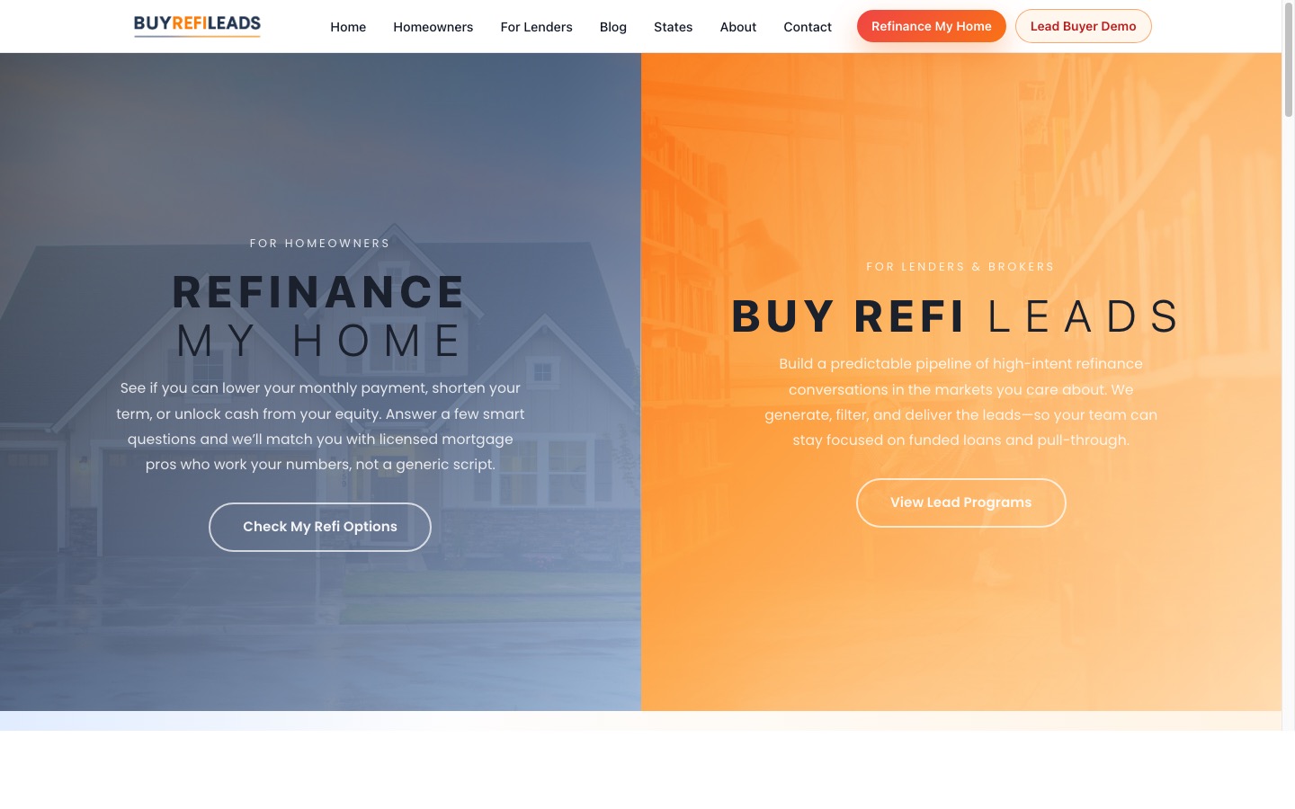
The Above-the-Fold CTA Rule Most SoCal Service Sites Break
You spent $7,500 on a new website for your Pilates studio in Carlsbad. The designer delivered something that looked incredible — a full-bleed hero image of your studio bathed in morning light, clean typography, a color palette pulled straight from your brand boards. You launched in January and sent the link to everyone you knew.
By Loren Anderson · June 22, 2026 · 32 min read
What "Above the Fold" Actually Means on a Modern Screen
The phrase comes from print newspapers. The top half of a folded paper — the portion visible on a newsstand rack — had to sell the story before anyone reached for it. On a website, the fold is whatever a visitor sees before they scroll.
On a standard 1080p desktop monitor, that window is roughly 600–700 pixels of vertical space below your navigation bar. On a mobile phone — where most of your SoCal customers are landing from Google — it is even less. A visitor on an iPhone 14 in portrait mode sees about 650 CSS pixels of your page before they have to make a decision: scroll, click, or leave.
Research from Nielsen Norman Group on scrolling and attention shows that users spend the overwhelming majority of their page-viewing time in the top portion of a page, and engagement drops sharply with every 100 pixels lower you go. What lives in that first visible window determines whether a visitor becomes a lead or a bounce.
The Above-the-Fold CTA Rule Most SoCal Service Sites Break
The rule is simple: one visible, specific call to action paired with a clear value statement — both readable without scrolling on any device. Most Southern California service websites break this rule in one of three ways.
The rule is not about design aesthetics. It is about clarity of intent. A visitor who lands on your homepage has one question: what does this business do, and can it help me? Your above-the-fold section has roughly four seconds to answer that before they hit the back button and click the next Google result.
What a Broken Above-the-Fold Section Actually Looks Like
Picture a functional fitness gym in Pacific Beach. Waterfront location, strong community culture, coaches who remember your name. The website: a full-screen video loop of athletes mid-box jump, the gym name fading in after three seconds, tagline reading "Train Different."
Train different than what? There is no CTA button anywhere above the fold. The navigation has seven items: Home, About, Classes, Schedule, Coaches, Blog, Contact. A new visitor — someone who just Googled "CrossFit Pacific Beach" — lands here with zero direction. So they scroll. Then they click "Classes." They find a PDF timetable that does not open properly on mobile. Then they leave and click the next result.
This gym was pulling 1,400 monthly website visitors and averaging nine new member inquiries per month. That is a 0.6% conversion rate. The baseline for local fitness businesses runs closer to 2–4%. Somewhere between 19 and 47 potential leads per month were landing on that homepage and leaving without a single action.
The fix was not a full redesign — it was restructuring the hero section around one visible, specific call to action. Changing the headline to "Pacific Beach's Strength Program for People Who've Tried Everything Else," adding "No contract. First week free. 60-second signup" directly beneath it, and swapping the faded video overlay for a solid "Start Your Free Week" button moved conversion from 0.6% to 2.1% within 45 days. Same traffic. Different homepage.
The Three-Part Formula for an Above-the-Fold CTA That Converts
After working on service business websites across San Diego County — from yoga studios in Solana Beach to training gyms near the Gaslamp Quarter — the same structure appears in every hero section that actually converts visitors into leads. It has three components.
1. A Value Statement, Not a Tagline
"Train Different" is a tagline. "San Diego's only strength program built around your injury history" is a value statement. A tagline tells a visitor what to feel about your brand. A value statement tells them what they get and why you are the better choice over the three other options Google just showed them. Keep yours under 12 words. Make it specific to your city, your method, or your measurable result — not to your values or your passion for what you do.
2. A Supporting Line That Handles the Objection
Most service business websites skip this entirely. Right below your headline, one sentence should neutralize the biggest reason someone would hesitate to click. For a fitness studio in Coronado or Carlsbad, that might be: "No contracts. First class free. Signup takes 30 seconds." For a home services company serving North County, it could be: "Licensed, insured, and operating from Oceanside to Del Mar — estimates within 24 hours." This line is not about you. It is about removing friction for the person reading it.
3. One CTA Button with a Verb and a Benefit
"Book Your Free Class" beats "Book Now." "Get Your Free Estimate" beats "Contact Us." "See This Week's Openings" beats "Schedule." The button should tell visitors exactly what happens when they click and give them a reason why clicking is worth their time. Place it in the upper-right quadrant of the hero section on desktop and centered below the headline on mobile. Use a solid, high-contrast fill — not a ghost (outline-only) button that vanishes against certain background images at different screen brightness levels.
The Numbers Behind Why This Matters for Local Service Businesses
SoCal consumers — especially in comparison-heavy markets like Del Mar, La Jolla, and Encinitas — move fast on mobile. The average session duration for local service searches sits well under three minutes. That is your entire window to convert a visitor into a lead, and most of it is spent above the fold.
Data from HubSpot's analysis of CTA performance across thousands of B2C websites found that action-specific, personalized calls to action convert up to 202% better than generic alternatives. That is not a rounding error. That is the difference between six inquiries a quarter and eighteen.
For local service businesses — fitness studios, medspas, contractors, dental offices — a 1–3% improvement in homepage conversion rate is measurable in actual revenue. If your studio charges $175 per month and you are getting 1,000 visitors a month at a 0.6% conversion rate, that is six new leads per month. Push that rate to 2.4% and you are pulling 24. At $175 per month, that gap represents over $3,000 in potential new monthly recurring revenue — without spending a dollar more on Google Ads or paid social.
None of that requires more traffic. It requires a homepage that tells visitors what to do.
Why SoCal Service Sites Keep Getting This Wrong
This is not a design quality problem. Some of the worst-converting websites I have seen were built by genuinely talented designers. The disconnect happens because designers are trained to solve visual problems, and business owners hire them to solve revenue problems. Those are not the same brief, and the difference rarely gets named at the start of a project.
When a designer builds a homepage, they are solving for visual hierarchy, whitespace, typography rhythm, and brand consistency. Those things matter. But they do not automatically produce a CTA that converts. A designer's typical success metric is client approval at delivery. A business owner's success metric is leads per month. Nobody on either side of that table stops to ask: "If someone lands here from a Google search for 'Pilates Carlsbad,' what is the first thing they will do?"
There is also what behavioral researchers call the curse of knowledge. When you have operated your fitness studio for four years, "Train Different" carries real meaning for you — you can picture the programming methodology, the culture, the coaching philosophy. Your website visitor cannot. They need you to spell out what makes you different in plain English in the first three seconds, paired with a button that makes the next step obvious.
The solution is not always to hire a different designer. It is to brief your designer with a conversion requirement alongside the brand requirement. Before a single pixel is placed, you should be able to answer three questions: who is landing here, what is the one thing we want them to do, and what headline makes that action feel worth taking? If your designer has not been given those answers, the resulting hero section will look great and convert poorly.
How to Audit and Fix Your Above-the-Fold CTA This Week
You do not need a full rebuild to fix this. The following process takes two hours or less and can be handed off to a developer the same day.
Step 1: Pull up your site on a real phone. Not the mobile preview in your browser's developer tools. A physical phone, held the way a customer would hold it. Screenshot everything visible before you scroll. That image is your above-the-fold section. Is there a CTA button visible? Can you read the headline clearly? Does the background image create enough contrast for the text to be legible? If the answer to any of these is no, you have found your conversion leak.
Step 2: Write your value statement from scratch. Open a notes app and finish this sentence: "My business is the right choice for [specific customer type] in [specific location] because [specific reason]." That raw sentence is your headline material. Edit it down to 10–12 words. Remove adjectives that carry no proof — "premier," "experienced," "trusted" mean nothing without evidence to back them up. Specificity earns trust faster than any of those words.
Step 3: Identify and address one objection. Ask your front desk, your DMs, or yourself: what is the most common reason a first-time visitor does not book? Price uncertainty? Fear of commitment? Not sure if you serve their part of town? Write one sentence that addresses it directly. Keep it under 15 words. Put it immediately below the headline — not in the footer, not on an FAQ page.
Step 4: Pick one CTA and rewrite the button copy. What is the single best first action for someone who has never worked with you? A free trial class? A 15-minute call? A no-obligation estimate? Choose one and only one. Write the button text as a verb plus a benefit: "Try Your First Class Free" instead of "Get Started," "Book a Free 15-Minute Call" instead of "Schedule."
Step 5: Hand this brief to your developer. Four elements: value statement, objection handler, CTA button text, and one visual requirement — solid fill, high contrast, visible before any scrolling on iPhone. A capable front-end developer can implement this in under 90 minutes without touching the rest of the page.
Give the change 30 days with consistent traffic. Compare contact form submissions, call clicks, or booking completions against the prior 30-day period. In most local SoCal service sites where this structure gets applied correctly, the movement is visible within the first two weeks — not because visitors changed, but because you finally gave them a clear reason to act.
The above-the-fold CTA is not a design trend. It is the first functional test of whether your website earns its place in a Google search result. Fix the fold before you spend another dollar on traffic.
Questions
What does above the fold mean on a website?
Above the fold is everything visible to a visitor before they scroll. On a typical desktop monitor, that's roughly 600–700 pixels of vertical space below the navigation bar. On mobile, it's even less. The phrase comes from print newspapers, where the top half of a folded page had to sell the story before anyone reached for it at the newsstand.
Where should I place my CTA button on my homepage?
Place your primary CTA button in the upper-right area of the hero section on desktop and centered below the headline on mobile. It must be visible without scrolling on any device. Use a solid, high-contrast fill — not a ghost or outline-only button — so it reads clearly against background images regardless of screen brightness.
How many CTAs should be above the fold on a homepage?
One. Multiple CTAs above the fold split visitor attention and reduce overall conversion. Identify the single most valuable first action for a new visitor — a free trial, a booking, a consultation call — and make that the only option in the hero section. Secondary options can live further down the page once you've earned the scroll.
What makes a CTA button actually work?
An effective CTA button pairs a verb with a benefit. 'Book Your Free Class' outperforms 'Book Now.' 'Get Your Free Estimate' outperforms 'Contact Us.' The button text should tell visitors exactly what happens when they click and why it's worth their time. Then make sure it's high-contrast, solid-fill, and visible above the fold on every device.
Why is my website getting traffic but no leads?
Traffic without leads usually points to the same problem: your above-the-fold section isn't giving visitors a reason to act. Common causes include no visible CTA, a CTA too vague to click, or too many competing options. Pull up your homepage on a real phone and screenshot the first screen. If there's no clear, clickable button immediately visible, that's where your leads are going.
How do I write a homepage headline that converts?
Write a value statement, not a tagline. Answer three things in under 12 words: what you do, who you do it for, and why you're the better choice. Make it specific — mention your location, your method, or a measurable result. 'San Diego's only injury-focused strength program' beats 'Train Different' because it gives the reader something to hold onto.
Sources
More from the studio